UI UX Design Audit Checklist: Improve Your Website UX in 10 Steps
Mitu Das
super admin

I want to share something I've seen happen over and over again. A founder spends months building a product. They run ads. They write content. Traffic climbs. But conversions stay flat. Support tickets pile up. Users churn.
The marketing budget doubles. The problem stays the same.
I've audited over 60 digital products in the last eight years. In 90% of cases, the real issue wasn't the offer, the price, or the traffic source. It was the design experience and nobody had ever done a proper audit.
Here's a number that still shocks me: U.S. companies lose an estimated $1.4 trillion every year due to poor user experience. That's not a typo. Roughly 35% of potential revenue silently walks out the door because users hit friction and never come back.
A UI UX audit checklist is how you stop that from happening.
In this guide, I'll walk you through every step of a professional-grade UX design audit. You'll get the exact checklist I use with clients, the tools that matter most, and a clear system for turning your findings into real improvements not just a report that gathers dust. Let's get into it.
What Is a UI UX Audit
A UI/UX audit is a structured, evidence-based evaluation of a digital product, website, app, or platform that identifies usability issues, visual inconsistencies, accessibility gaps, conversion barriers, and opportunities to align the experience with the latest UI/UX design trends.
It looks at two layers:
- UI (User Interface) Audit evaluates the visual design layer: buttons, typography, colors, spacing, icon consistency, layout hierarchy. If it can be seen, a UI audit checks whether it communicates clearly and consistently.
- UX (User Experience) Audit evaluates the interaction layer: how users navigate, complete tasks, recover from errors, and ultimately achieve their goals. If it can be experienced, a UX audit checks whether it feels intuitive and frictionless.
Together, a combined UI UX audit checklist tells you what looks broken, what feels broken, and crucially why it's costing you users.
UI Audit vs. UX Audit: What's the Difference
| UI Audit | UX Audit | |
|---|---|---|
| Focus | Visual design elements | User flows and task completion |
| Questions Asked | Does it look consistent? | Does it work for the user? |
| Methods | Visual inspection, design system review | Heuristic evaluation, usability testing, analytics |
| Common Findings | Inconsistent buttons, low contrast text | Confusing navigation, abandoned forms |
Most teams need both. Skipping either one means solving only half the problem.
When Do You Need a UI UX Audit Checklist
You need a UX design audit when:
- Bounce rate is high but you can't explain why
- Users complain about navigation or confusing flows
- Conversion rates have dropped without a clear cause
- You're planning a redesign and want data before you spend budget
- You've added many features over time and the product feels cluttered
- Your mobile metrics are significantly worse than desktop
- You're receiving the same support questions repeatedly
You also need one when everything seems fine. The best time to audit is before problems show up in your numbers by then, you've already lost users.
Complete UI UX Audit Checklist: 10 Steps
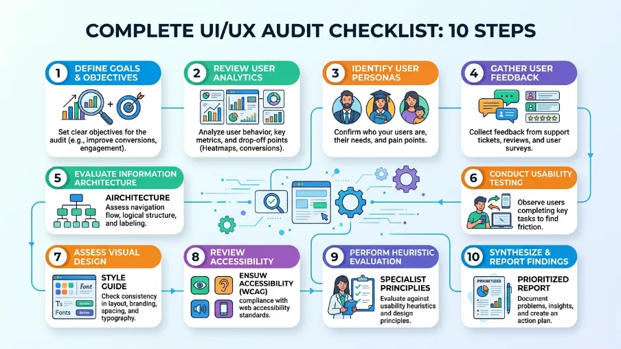
Step 1: Define the Scope and Goals Before You Start
This is the most skipped step. It's also the most important one.
Without clear goals, you end up with 80 audit findings and no idea what to fix first. With clear goals, you build a focused action plan that actually gets implemented.
Before you open a single analytics dashboard, answer these questions:
- What specific part of the product are we auditing? (Full site? Checkout flow? Onboarding?)
- What business metric is underperforming? (Conversion rate, bounce rate, activation, retention?)
- What do we already know or suspect is a problem?
- What will we do with the findings?
Write your objectives as specific statements. For example:
"Identify why 68% of users abandon the checkout page on mobile."
"Find usability barriers in the onboarding flow that prevent users from completing setup."
This single step makes everything else in your UI UX audit checklist more effective because you're solving a real problem, not just describing the design.
Step 2: Collect Quantitative and Qualitative Data
Never start an audit with opinions. Start with evidence.
A professional UX design audit combines two types of data:
Quantitative data tells you what is happening:
- Bounce rate and exit rate by page
- Conversion funnel drop-off points
- Session duration and pages per session
- Task completion rates
- Error frequency in forms
Qualitative data tells you why it's happening:
- Session recordings (watch real users struggle in real time)
- Heatmaps (see where users click, scroll, and ignore)
- User interviews and survey responses
- Support tickets and live chat logs
- Usability test recordings
Recommended Audit Tools by Category
| Category | Free Tools | Paid Tools |
|---|---|---|
| Analytics | Google Analytics 4, Microsoft Clarity | Mixpanel, Amplitude |
| Heatmaps & Recordings | Microsoft Clarity, Hotjar (free tier) | Hotjar, FullStory |
| Accessibility Testing | WAVE, axe DevTools (Chrome extension) | Deque axe Pro |
| Performance | Google PageSpeed Insights, Lighthouse | GTmetrix Pro |
| Usability Testing | Maze (free tier), Lookback | UserTesting, Maze |
| Design Review | Figma, browser DevTools |
Start with Google Analytics and Microsoft Clarity. Both are free. Together, they'll show you the biggest friction points within your first session.
Step 3: Audit Navigation and Information Architecture
Navigation is where UX audits most reliably uncover revenue-impacting problems.
Research from the Nielsen Norman Group shows users spend an average of 6.44 seconds scanning a website's main navigation on their first visit. If they can't find what they need in that window, many leave.
Navigation Audit Checklist
- Main navigation is visible immediately without scrolling on all devices
- Navigation labels use user language, not internal business jargon (not "Solutions" use "How We Help")
- Users can reach any critical page in 3 clicks or fewer
- Active page states clearly show users where they are
- [Breadcrumbs are used on pages that are more than 2 levels deep
- Search functionality exists on content-heavy sites
- Mobile navigation is reachable with one thumb (bottom nav or accessible hamburger)
- The logo links back to the homepage
- Footer includes key links, contact info, and secondary navigation
- No broken links or 404 errors on core navigation paths
Common failure I see: Navigation labels that reflect internal company structure instead of what users are actually looking for. "Products," "Solutions," "Offerings" users don't search in these terms. Check your site search logs to see what users actually type when they're looking for something. That's your real navigation.
Step 4: Evaluate Visual Consistency and UI Design
Inconsistent UI design is a silent trust killer. When a user encounters three different button styles on three different pages, something feels off even if they can't name it. That feeling erodes confidence in your product.
Visual Consistency Checklist
- All CTA buttons share the same style for the same action type (primary, secondary, destructive)
- Typography is limited to 2 font families maximum, used consistently throughout
- Body text minimum size is 16px (especially on mobile)
- A defined color palette is applied consistently (max 3 primary + 2 accent colors)
- Spacing and padding are consistent between similar page sections
- Icons come from the same visual family and are the same size in similar contexts
- Form elements look and behave the same across all pages
- Every page clearly feels like it belongs to the same product
The key question to ask on every page: "If a user saw this page alone, without context, would it look like it belongs to the same product?"
If the answer is no, you have a UI consistency problem. A design system even a simple one solves this permanently.
Step 5: Audit Content Clarity and Copywriting Quality
Beautiful design fails when users can't understand what you're saying. Content is part of the UX. Often the most impactful part.
Content Clarity Checklist
- Value proposition is clearly stated within the first viewport (above the fold)
- Headings accurately describe the content in each section no clever wordplay that sacrifices clarity
- Body text uses simple, plain language (aim for Flesch-Kincaid Grade 8 or lower for general audiences)
- CTA button copy is specific and action-oriented ("Start Free Trial" not "Submit")
- Error messages explain what went wrong and how to fix it
- Placeholder text in form fields supplements labels it does not replace them
- Microcopy (helper text, tooltips, empty states) is clear and helpful
- Page titles and meta descriptions match what users actually find on the page
Quick test: Read your homepage headline out loud to someone who has never seen your product. Ask them to explain back to you what your product does. If they hesitate or get it wrong, your value proposition needs work.
Step 6: Run a Full Accessibility Audit
Here's the hard truth: most teams skip accessibility until a legal threat arrives. That's a mistake for business reasons as well as ethical ones.
1.3 billion people worldwide live with some form of disability. Accessibility improvements benefit everyone, including users on slow connections, older users, and people using phones in bright sunlight with reduced screen contrast.
As of June 28, 2025, the European Accessibility Act requires WCAG 2.2 Level AA compliance for most digital products in the EU. The U.S. ADA has increasingly been interpreted to require the same.
Accessibility Audit Checklist (WCAG 2.2 AA)
- Text contrast ratio is at least 4.5:1 for body text (3:1 for large text and UI components)
- All images have descriptive, meaningful alt text (decorative images use
alt="") - Every interactive element is reachable and operable via keyboard alone (Tab through every page)
- Focus states are clearly visible users can always see which element is focused
- Form fields have programmatically associated labels (not just placeholder text)
- Error messages identify the specific field and describe the fix
- Videos have accurate captions and transcripts
- Screen reader compatibility is tested with NVDA (Windows) or VoiceOver (Mac/iOS)
- No flashing content that exceeds 3 flashes per second (seizure risk)
- Clickable elements meet minimum target size of 24×24 pixels (WCAG 2.2 requirement)
Tools to run right now:
- WAVE (wave.webaim.org) paste any URL, get instant accessibility report
- axe DevTools free Chrome extension, catches 57% of WCAG issues automatically
- Colour Contrast Analyser desktop tool for checking any color pair
Start with WAVE. Run it on your 5 most-visited pages. The findings alone will prioritize your next sprint.
Step 7: Audit Forms and Conversion-Critical Interactions
Forms are where conversions happen. And forms are where most of them die.
The Baymard Institute, which has accumulated over 200,000 hours of e-commerce UX research, found that 28% of cart abandonments are caused directly by overly complicated checkout processes. Every unnecessary form field, every vague error message, every missing label costs real conversions.
Forms and Interactions Checklist
- Every form field has a visible, persistent label (never just placeholder text)
- Required fields are clearly marked and optional fields are identified or removed
- Inline validation provides real-time feedback as users type (not just on submit)
- Error messages name the specific field and tell users how to correct the problem
- Form is as short as possible every field that isn't necessary is removed
- Multi-step forms show a clear progress indicator
- Successful submission shows a clear confirmation message or next step
- Buttons show visual loading states for actions that take more than 1 second
- Auto-complete is enabled for standard fields (name, email, address)
- Password fields have a "show password" toggle
Quick win: Audit your most important form by counting every field. Remove or make optional anything you don't need at that specific point in the user journey. Every field you eliminate increases completion rates typically by 5–10% per removed field.
Step 8: Test the Mobile Experience as a Separate Pass
This is non-negotiable in 2025. Over 60% of global web traffic comes from mobile devices. But mobile is not just a smaller version of your desktop site. It's a completely different interaction context.
Different input method. Different thumb reach zones. Often slower connection. Different cognitive load. Mobile deserves its own dedicated audit pass not a checkbox at the end.
Mobile UX Audit Checklist
- All tap targets are minimum 44×44 pixels (iOS Human Interface Guidelines) or 24×24px minimum (WCAG 2.2)
- No horizontal scrolling on any screen size
- Text is readable without zooming (minimum 16px)
- Navigation is reachable with one thumb critical actions are in the bottom half of the screen
- Pop-ups and modals are easy to dismiss on small screens
- Forms use the correct keyboard type for each field (numeric keyboard for phone numbers, email keyboard for email fields)
- Images and media are compressed and responsive
- Page loads in under 3 seconds on a 4G mobile connection
- Android back button and iOS back swipe behave as expected in all flows
- No elements are hidden by fixed headers or cookie banners
Critical rule: Test on real devices, not just browser resize tools. Chrome DevTools' device emulator is useful for layouts but it does not replicate real touch behavior, real keyboard interactions, or real performance on a mobile chipset. Borrow a few different phones and tap through your flows.
Step 9: Measure Core Web Vitals and Technical Performance
Speed is not a technical detail. It is user experience. A site that takes 4 seconds to load on mobile has already lost a significant portion of its visitors they left before seeing a single word of your content.
Google's Core Web Vitals are the industry standard for measuring perceived performance. They directly influence both user experience and search rankings.
Performance Audit Checklist
- LCP (Largest Contentful Paint) under 2.5 seconds measures perceived load speed
- INP (Interaction to Next Paint) under 200ms measures responsiveness to clicks and inputs
- CLS (Cumulative Layout Shift) under 0.1 measures visual stability (no jumping content)
- Images are in modern formats (WebP or AVIF) and compressed
- Images use
widthandheightattributes to prevent layout shift - Third-party scripts (chat widgets, analytics, ads) are deferred or lazy-loaded
- Browser caching is enabled for returning visitors
- A CDN (Content Delivery Network) is used for static assets
- Server response time (TTFB) is under 600ms
Run this now: Go to PageSpeed Insights, enter your URL, and check your Core Web Vitals scores on both mobile and desktop. Focus on your mobile score first it's almost always the bigger opportunity.
Step 10: Prioritize Findings and Build Your Action Plan
This is the step that separates a useful audit from one that just produces a report nobody reads.
You now have a list of findings. Some are critical. Some are cosmetic. Some are quick to fix. Some require weeks of development. If you try to fix everything at once, nothing gets fixed.
Use this simple prioritization framework the Impact vs. Effort matrix:
Priority 1 Fix Now (High Impact, Low Effort): These are your quick wins. Broken CTA buttons, missing form labels, contrast failures, missing alt text, unclear error messages. Fix these in days, not weeks.
Priority 2 Fix Soon (High Impact, Higher Effort): Navigation restructure, mobile layout overhaul, form redesign, checkout flow improvements. These require planning and resources but directly affect revenue.
Priority 3 Plan and Schedule (Lower Impact or Complex): Full design system creation, accessibility overhaul, performance refactoring. Important, but not urgent.
Priority 4 Monitor or Defer: Cosmetic inconsistencies, minor copy tweaks, low-traffic page issues. Log them and revisit in the next audit cycle.
For each finding, document:
- What the problem is
- Why it matters (user impact + business impact)
- How to fix it (specific recommendation)
- Who owns the fix
- Target deadline
Run a follow-up measurement in 30–60 days after implementing fixes. Compare your key metrics: bounce rate, conversion rate, form completion rate, and Core Web Vitals scores. This turns your audit into a measurable ROI exercise not just a design project.
UI UX Audit Checklist: Complete Quick Reference
Print this or bookmark it. This is the full checklist at a glance.
Pre-Audit
- Define 2–3 specific audit objectives
- Identified KPIs to measure before and after
- Pulled analytics data (bounce rate, exit pages, conversion funnel)
- Collected heatmaps and/or session recordings
- Gathered user feedback (support tickets, interviews, surveys)
Navigation & Architecture
- Navigation labels use user language
- All critical pages reachable in 3 clicks
- Mobile navigation is thumb-friendly
- Active states and breadcrumbs show user location
- No broken links on key paths
Visual Consistency (UI)
- Consistent button styles and CTA design
- Max 2 font families, used consistently
- Defined color palette applied throughout
- Consistent spacing and layout patterns
- Icons from same visual family
Content Clarity
- Value proposition clear in first viewport
- Plain language, no unexplained jargon
- CTAs are action-specific ("Download Guide" not "Click Here")
- Error messages explain the fix
- Form labels always visible
Accessibility (WCAG 2.2 AA)
- Text contrast ≥ 4.5:1
- Full keyboard navigation works
- Focus states visible
- All images have alt text
- Forms have proper associated labels
- Tap targets ≥ 24×24px
Forms and Interactions
- Minimum required fields only
- Inline real-time validation
- Specific, helpful error messages
- Loading states on slow actions
- Clear success confirmation
Mobile Experience
- Tap targets ≥ 44×44px
- No horizontal scrolling
- Correct keyboard types on form fields
- Tested on real devices (not just emulator)
- Page loads in under 3 seconds on mobile
Core Web Vitals & Performance
- LCP < 2.5s
- INP < 200ms
- CLS < 0.1
- Images in WebP/AVIF format
- Third-party scripts deferred
Post-Audit
- Findings prioritized by Impact vs. Effort
- Each issue has an owner and deadline
- KPIs to be tracked after implementation
- Next audit date scheduled (every 6–12 months)
Real Cost of Skipping a UX Audit
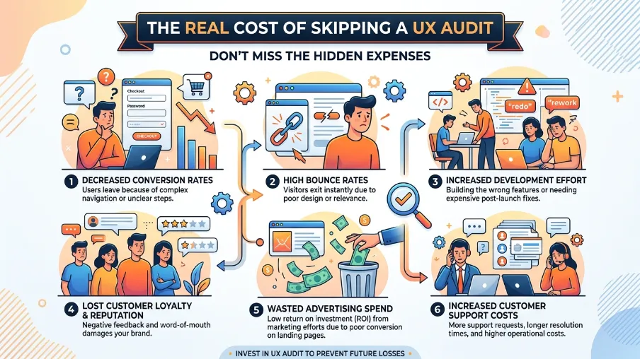
Let me leave you with a thought that I find genuinely motivating.
Every broken interaction on your site is a user decision moment. Someone arrives. They want something. They can't figure out how to get it. They leave. That moment costs you not once, but every single time it happens to every user who encounters that friction point.
You can't fix what you haven't found. And you can't find it by looking at your own product with your own eyes because you're too close to it. You know where everything is. You know what every button does. Your users don't.
A UI UX audit checklist gives you a structured way to see your product the way a stranger sees it. With fresh eyes. With data behind every observation. And with a clear path from problems to fixes. That's why effective UI/UX design isn't just about making interfaces look better. It’s about removing friction, improving usability, and helping users achieve their goals with confidence.
The companies I've seen get the most out of audits aren't the ones with the biggest design budgets. They're the ones who treat it as a regular practice: quarterly check-ins, post-launch reviews, and data-informed iterations. Not a one-time project, but a discipline that continuously strengthens their UI/UX design and drives better user experiences over time.
Start Your UI UX Audit Today
You now have everything you need: the full 10-step process, the complete checklist, the right tools for each stage, and a prioritization system that turns findings into action.
Your first move: Open Google Analytics and pull your top 10 pages by bounce rate. Open Microsoft Clarity and watch 5 session recordings on those pages. In 30 minutes, you'll already know more about your users' real experience than most teams know after months of assumptions.
If you want expert help running your audit or if you'd like a professional second opinion on your findings the checklist above is exactly what experienced UX agencies use as their starting point.
Run the audit. Fix the friction. Watch the numbers move.
Frequently Asked Questions About UI UX Audits
What is a UI UX audit checklist?
A UI UX audit checklist is a structured list of criteria used to systematically evaluate a website or app's user interface (visual design) and user experience (usability and flows). It covers navigation, visual consistency, accessibility, mobile responsiveness, form design, content clarity, and performance helping teams identify usability issues and conversion barriers with evidence, not guesswork.
How long does a UI UX audit take?
A focused UX audit on a specific flow (like checkout or onboarding) typically takes 1–3 days. A full website or app audit covering all major sections takes 1–2 weeks. Complex enterprise products with multiple user journeys can take 4–8 weeks. Most professional agencies charge between $1,000 and $5,000 for a standard UI UX audit, depending on scope and depth.
How is a UX audit different from usability testing?
A UX audit is an expert-led, internal evaluation it analyzes your product against established heuristics, analytics data, and best practices without requiring live users. A usability test observes real users completing real tasks in real time. Both methods complement each other: a UX audit tells you what issues exist, while usability testing reveals why users struggle. For most teams, start with the audit to identify focus areas, then validate findings with usability testing.
How often should I run a UX audit?
Most products benefit from a full audit every 6–12 months. Additionally, run a targeted mini-audit whenever you: launch a major new feature, notice a sudden drop in conversion rates, receive repeated user complaints about the same issue, or plan a redesign. Think of it like a product health check you don't wait until something breaks.
Can I do a UI UX audit without a designer?
Yes especially for the data-gathering phase. Tools like Google Analytics, Microsoft Clarity, WAVE, and PageSpeed Insights require no design expertise and surface the most critical issues automatically. However, for interpreting findings, recommending design solutions, and prioritizing changes strategically, involving an experienced UX designer or hiring a UX audit agency adds significant value. If design isn't your core skill, a professional audit pays for itself in improved conversions.


FAQ
Frequently Asked Questions
We offer end-to-end digital solutions including website design & development, UI/UX design, SEO, custom ERP systems, graphics & brand identity, and digital marketing.
Timelines vary by project scope. A standard website typically takes 3-6 weeks, while complex ERP or web application projects may take 2-5 months.
Yes - we offer ongoing support and maintenance packages for all projects. Our team is available to handle updates, bug fixes, performance monitoring, and feature additions.
Absolutely. Visit our Works section to browse our portfolio of completed projects across various industries and service categories.
Simply reach out via our contact form or call us directly. We will schedule a free consultation to understand your needs and provide a tailored proposal.