How to Design a Modern Website in 2026
Mitu Das
super admin
Honestly, my friend asked me the other day how to design a modern website, and I told him the same thing I'd tell anyone: start with your user, not your color palette. Get the strategy right first, build mobile-first, keep things clean and fast, and make navigation dead simple. Do those things well and you're already ahead of 90% of websites out there. And that's really what good web development comes down to. This guide covers exactly how to design and develop a modern, user-friendly website from strategy and structure to performance and search optimization, in plain, practical language you can actually use.
What Does It Mean to Design a Modern Website
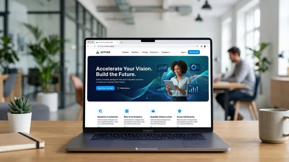
The first question anyone serious about modern web design needs to answer is this: what actually makes a website modern? The answer has nothing to do with visual trends. Glassmorphism, dark mode gradients, and oversized cursor effects come and go. A truly modern website in 2026 is defined by how well it serves the person using it.
When people search for how to design a modern website, they are really asking how to build something that loads fast on any device, communicates value clearly within the first few seconds, guides visitors naturally toward a decision, and earns the kind of trust that turns a first-time visitor into a paying customer. A modern website is one that prioritizes user experience through responsive design, is built on clean and organized design principles, and is structured in a way that search engines can fully understand and index.
In short, a modern website earns trust, answers questions, and converts visitors regardless of whether they arrive on a desktop in an office or a phone on a commute. Every design decision, from typography choices to button placement, should serve those three goals.
Start With Strategy Before You Touch a Single Design Tool

The most common mistake people make when they start thinking about how to design a modern website is opening a design application before defining a clear purpose. Professional web designers call this the strategy-first approach, and it is the single biggest factor that separates websites that perform from websites that simply exist.
Before sketching a wireframe or choosing a color palette, answer three foundational questions honestly. Who exactly is your audience? What is the single most important action you want a visitor to take on each page? And what makes your business meaningfully different from the nearest alternative?
Your answers to those questions drive every design decision that follows. The color palette, the layout of the homepage, the order of information on a services page, the wording on your call-to-action button: all of it flows from a clear understanding of your audience and your purpose.
This is why professional website development services always begin with a discovery phase. It isn't billable padding. It is the difference between a website that looks polished in a portfolio presentation and one that actually generates business for the client month after month.
Responsive and Mobile-First Design: Technical Foundation of Modern Web Design
If there is one principle above all others that defines how to design a modern website in 2026, it is this: design for mobile first, then scale up to larger screens. More than 60% of global web traffic now comes from smartphones and tablets. Google officially uses mobile-first indexing, meaning it crawls, evaluates, and ranks the mobile version of your website when determining your position in search results. If your mobile experience is broken, your rankings suffer, regardless of how good your desktop design looks.
Responsive design means your website layout fluidly adapts to any screen size without breaking, losing content, or becoming frustrating to navigate. A page that looks beautiful on a 27-inch monitor but requires pinching and zooming on an iPhone is not a responsive design. It is a desktop design with a mobile problem.
The practical workflow is straightforward. Design your layouts starting at 375 pixels wide, the standard width of a modern smartphone screen, and progressively enhance the layout for tablets and desktops. Designing for the smallest screen first forces you to make clear decisions about what information is actually important. That discipline almost always produces cleaner, more focused designs at every screen size.
Touch targets on mobile, including buttons, navigation links, and form fields, should be at least 44 by 44 pixels to be comfortably usable with a finger. Text should be readable without zooming. Navigation should function entirely without a mouse. These are not optional accessibility considerations. They are the baseline expectations of any website that genuinely prioritizes user experience through responsive design.
Clean Layouts, Whitespace, and Visual Hierarchy
Understanding how to design a modern website means understanding whitespace. Whitespace is the empty space between and around elements on a page, and it is one of the most powerful and most misunderstood tools in web design.
Many clients, especially those who are new to working with a web designer, initially see whitespace as wasted space. They want to fill every available area with content, promotions, or images. Experienced designers know the opposite is true. When used intentionally, whitespace reduces cognitive load, draws the eye toward important elements, makes text significantly easier to read, and makes everything on the page feel more premium and trustworthy. Apple's website looks expensive because whitespace signals confidence and quality. Amazon's website looks dense because the business model demands it. Your layout should reflect the brand impression you want to make.
Visual hierarchy is the related principle that not everything on a page should compete equally for the visitor's attention. The most important elements, your headline, your primary call-to-action, your core value proposition, should be visually dominant. Supporting information should recede. Designers achieve this through deliberate choices in size, typographic weight, color, spacing, and position on the page.
The hero section of a website, the area that is visible without any scrolling, is where visual hierarchy matters most. A strong hero section answers three questions in under five seconds: what is this, why should I care, and what should I do next. If your hero section requires a visitor to read three paragraphs before they understand what your business offers, it needs to be redesigned. That is one of the most consistent findings in user experience research across every industry.
Consistent Typography That Communicates Professionalism
Typography is the element of web design that is most frequently underestimated and most frequently done wrong. Around 90% of everything a visitor interacts with on a website is text. Your font choices, your sizing system, your line spacing, and your typographic hierarchy directly determine how readable, professional, and trustworthy your site feels to every person who visits it.
A clean, modern typography system for a website uses two or three typefaces at most. A display or serif font for headings conveys personality and authority. A highly legible sans-serif for body copy maximizes reading comfort over longer passages. A monospace typeface is sometimes added for technical labels, code snippets, or data presentation. Anything beyond three typefaces creates visual noise and signals a lack of design discipline.
Consistent typography means establishing a clear scale and applying it without exception. There should be exactly one H1 heading per page, the largest and most visually dominant. H2 headings mark major sections. H3 headings mark subsections within those. Body text belongs at a base size of 16 to 18 pixels with a line height of 1.6 to 1.8 for comfortable sustained reading. The measure, which is the number of characters per line of text, should stay between 60 and 75 characters. Typographic research consistently identifies this range as optimal for reading comprehension and reading speed.
These are not aesthetic preferences based on personal taste. They are the accumulated findings of decades of research into how people read on screens, and ignoring them produces websites that feel subtly harder to use without visitors being able to articulate exactly why.
Performance Optimization: Fast Loading Times Are a Design Requirement
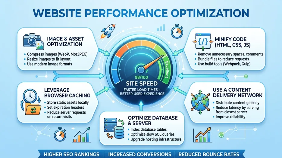
Anyone researching how to design a modern website will quickly find the same message repeated by every credible source: speed matters more than almost anything else. Fast loading times are not a nice-to-have technical feature. They are a fundamental design requirement, a user experience requirement, and a search ranking requirement all at once.
Google's Core Web Vitals make this explicit. The Largest Contentful Paint metric, which measures how long it takes for the main content of a page to load and become visible, should be under 2.5 seconds for a page to be rated as Good by Google. Beyond 4 seconds, Google rates it as Poor. At that threshold, you are simultaneously losing search rankings and real visitors at every moment the site is live.
The data on user behavior supports this urgency. Research consistently shows that a one-second delay in page loading reduces conversions by approximately 7%. Visitors on mobile connections are especially sensitive and significantly more likely to abandon a page that doesn't show meaningful content within three seconds.
The most impactful performance improvements are often straightforward. Converting images from PNG or JPEG to WebP or AVIF format reduces file sizes by 25 to 35% with no visible quality difference. Lazy-loading images below the visible area means the browser downloads only what the visitor has actually scrolled to. Minifying CSS and JavaScript removes unnecessary characters from code files without changing how they function. A Content Delivery Network serves your files from servers located near each visitor, cutting network latency. Enabling browser caching means returning visitors load your site almost instantly because their browser already has most of the files stored locally from their previous visit.
Google's free Lighthouse tool, available directly inside Chrome DevTools, generates a performance score and a prioritized list of specific improvements for any page. Run it regularly throughout development. Aim for scores above 90 across performance, accessibility, best practices, and SEO. It is the fastest way to identify exactly where you are losing speed and search ranking potential simultaneously.
Intuitive Navigation That Keeps Visitors Engaged
Poor navigation is one of the most consistently cited reasons users leave a website without converting. When visitors cannot find what they are looking for quickly and without confusion, they do not spend time digging through menus. They leave and find a competitor whose website makes it easier.
Intuitive navigation means the path to any important content or action is immediately obvious without any instruction or exploration. The primary menu should contain between five and seven clearly labeled items. Beyond that, visitors face decision fatigue, which causes disengagement. Related pages should be grouped under logical dropdown menus, but nesting should never go deeper than two levels. A three-level navigation hierarchy is almost always a sign that the underlying information architecture needs to be rethought.
Your logo should always link back to the homepage. This is a convention so widely established that violating it creates genuine confusion. The most important conversion action on your site, whether that's booking a consultation, requesting a quote, or starting a free trial, should appear as a visually distinct button in the top navigation. It should never compete equally with other menu items as plain text.
On mobile devices, the hamburger menu icon that opens a navigation drawer is the accepted and expected convention. When implemented well, the drawer opens full-width, can be dismissed with a tap outside it or a visible close button, and presents every menu item at a size that is easy to tap without requiring precision.
Breadcrumb navigation, the trail of links showing a visitor their location within the site such as Home, then Services, then Web Design, is valuable on content-rich websites. It helps users orient themselves, reduces reliance on the browser back button, and provides meaningful internal linking structure that search engines use to understand the relationships between your content pages.
Engaging Visuals, SVG Icons, and Purposeful Motion
Every visual element on a modern website should earn its place by communicating something that words alone would take longer to convey, or by reinforcing the emotional tone and credibility of the brand. Decoration without purpose is noise, and noise reduces trust.
SVG icons are the current standard for iconography in modern web design. They are vector-based, which means they scale to any size and remain perfectly sharp on every screen, including high-resolution Retina displays, without any quality degradation. They are styled directly with CSS, allowing color and size changes without creating new image files. And they are tiny in file size, adding negligible weight to page load times. Any website still using PNG or JPEG files for interface icons is already behind where modern web development has landed.
Photography should be purposeful and high quality. The generic stock photo of professionals in a conference room has become such a recognized visual cliche that it actively undermines credibility rather than building it. Real photographs of your team, your workspace, your product, or your actual clients build far more trust than any polished stock image. When authentic photography is not available, well-crafted custom illustrations or abstract brand visuals are more effective alternatives.
Motion, including subtle scroll-triggered animations, element reveal transitions, and hover state feedback, improves user experience when applied with restraint. Animations that serve the interface by providing clear feedback, guiding attention to important elements, or making transitions feel natural and fluid are genuinely valuable. Animations that exist purely to demonstrate technical capability or fill visual space are distractions. Every animated element should have a clear functional justification, and all animations must respect the user's system-level preference to reduce motion, an accessibility setting used by a meaningful portion of the population.
How to Design and Develop a Modern Website: A Practical Step-by-Step Framework
Pulling together everything covered in this guide, here is the sequence that professional website development services follow when designing and developing a modern, user-friendly website from a blank page.
Start with audience research and clear goal definition. Understand who you are building for, what they need to find or accomplish, and what business success looks like. Every subsequent decision in the process is measured against this foundation. Without it, there is no basis for evaluating whether any design choice is good or not.
Define your site's information architecture before designing a single page. Decide which pages the site needs, how those pages relate to each other, and what the primary paths through the site are for different visitor types. A simple sitemap is worth more than hours of visual design work done without it.
Design the mobile layout first, then enhance progressively for larger screens. Establish your typography scale, color system, and layout grid. Build a small component library covering buttons, form fields, cards, and navigation elements before designing full page layouts. Consistency at the component level produces consistency across the entire site.
Build with semantic HTML from the start. Every heading, paragraph, list, anchor tag, and image should use the correct HTML element for its content type. This matters for accessibility, for search engine understanding, and for the long-term maintainability of the codebase.
Optimize for performance throughout the build, not as a final cleanup step. Choose the right image formats from day one. Write lean CSS without unnecessary redundancy. Run Lighthouse audits regularly as new pages are developed. Technical debt in web performance compounds quickly and costs significantly more to fix after launch.
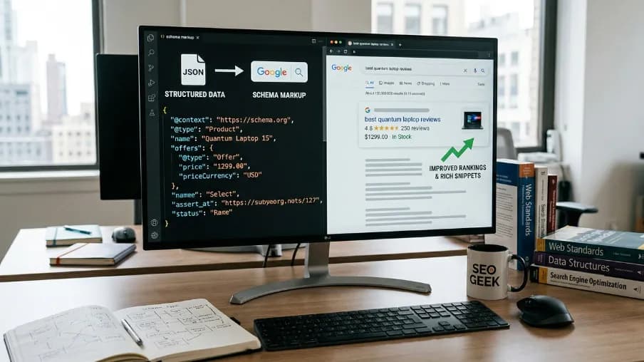
Implement SEO fundamentals on every single page before it goes live: title tags, meta descriptions, heading hierarchy, image alt text, internal links, and structured data markup where appropriate. None of this should be handled as a retrofit after the site is already live and indexed.
Test extensively before launch. Test on real physical devices across different operating system versions, not only browser emulators. Test across multiple browsers. Test every form submission path. Test loading speed on both fast and slow network connections. Test full keyboard-only navigation for accessibility compliance. If your audience includes users with visual impairments, test with a screen reader.
Final Thoughts
Knowing how to design a modern website in 2026 is ultimately not about mastering any single tool, following any specific visual trend, or checking items off a technical list. It is about understanding your users deeply enough to make good decisions on their behalf, applying established design principles with consistency and intention, and building something that genuinely works: for the person using it, for the business behind it, and for the search engines and AI systems that determine whether anyone finds it in the first place.
Responsive and mobile-first layouts, clean typography with proper hierarchy, whitespace used with intention, consistent visual design, fast loading times, intuitive navigation, purposeful visuals, and SEO integrated from the beginning: these are not separate checkboxes on a project plan. They are interconnected principles that together define the difference between a professional website that earns business and a placeholder that merely occupies a domain.
If you are planning a new website or a redesign and want expert guidance from strategy and user experience through to custom software development and web design, the best time to start that conversation is before decisions have been made that are expensive or time-consuming to reverse.
Frequently Asked Questions About How to Design a Modern Website
What is the most important element of modern website design?
The most important element of modern website design is user experience: specifically, how quickly and easily a visitor can understand what the site offers and take the action they came to take. Every other element, including responsive design, clean typography, fast loading times, intuitive navigation, and visual hierarchy, exists entirely in service of that goal.
How long does it take to design a modern website from scratch?
A straightforward business website with five to ten pages typically takes four to eight weeks to design and develop from scratch. A more complex site with custom functionality, an e-commerce system, or a large content library can take three to six months or longer. The timeline depends significantly on how quickly content, feedback, and client approvals are provided. The design and development process itself is rarely the bottleneck on most projects.
What is the difference between responsive design and mobile-first design?
Responsive design means a website automatically adapts its layout to different screen sizes. Mobile-first design is a workflow methodology in which the designer creates the mobile layout before the desktop layout, rather than the other way around. All mobile-first websites are responsive by definition, but not all responsive websites are designed mobile-first. The mobile-first approach consistently produces cleaner and more focused results because designing for the smallest screen forces ruthless prioritization of what content actually matters.
How does website design affect search engine optimization?
Website design affects SEO in multiple direct ways. Page loading speed is a confirmed ranking factor. Mobile-friendliness determines how Google crawls and indexes your site under its mobile-first indexing system. Semantic HTML structure communicates the meaning and organization of your content to search engine crawlers. Clean internal linking distributes ranking authority and establishes topical relevance across your pages. Poor user experience, reflected in high bounce rates and low time on page, sends negative behavioral signals to ranking algorithms. Good web design and effective SEO reinforce each other rather than existing in tension.
Do I need custom web design or can I use a website builder?
Website builders such as Webflow, Squarespace, and WordPress with a premium theme are excellent choices for small businesses, portfolios, and service businesses where speed to market and budget constraints are the primary considerations. Custom software development and web design becomes the right investment when you need functionality that no template can provide, performance that scales with significant traffic, deep integrations with third-party systems, or a brand experience that genuinely differentiates you from competitors. If your website is a direct revenue driver or a meaningful competitive advantage, custom development is almost always the better long-term decision.


FAQ
Frequently Asked Questions
We offer end-to-end digital solutions including website design & development, UI/UX design, SEO, custom ERP systems, graphics & brand identity, and digital marketing.
Timelines vary by project scope. A standard website typically takes 3-6 weeks, while complex ERP or web application projects may take 2-5 months.
Yes - we offer ongoing support and maintenance packages for all projects. Our team is available to handle updates, bug fixes, performance monitoring, and feature additions.
Absolutely. Visit our Works section to browse our portfolio of completed projects across various industries and service categories.
Simply reach out via our contact form or call us directly. We will schedule a free consultation to understand your needs and provide a tailored proposal.