How Good UI/UX Design Increased User Retention by 35%
Mitu Das
super admin

I've watched businesses pour thousands of dollars into ads, SEO, and marketing then lose users in under 10 seconds because their app or website felt broken. Not broken technically. Just confusing.
That's the UI/UX problem nobody talks about enough.
Here's what I've learned: getting users to your product is only half the battle. Keeping them is where the real money is. And good UI/UX design is the single most overlooked tool for doing exactly that.
In this article, I'll show you how thoughtful design directly increases user retention, what mistakes are silently killing your product, and what you can do about it even if you're not a designer.
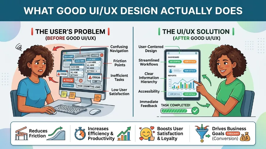
What Exactly Is UI/UX Design
Before we go deep, let me clear this up quickly.
UI (User Interface) is what your users see buttons, colors, fonts, icons, layouts.
UX (User Experience) is what your users feel how easy it is to navigate, how natural the flow feels, how long it takes to find what they need.
One handles the look. The other handles the feeling.
Both matter. But most businesses only think about UI they make it look pretty and stop there. That's a mistake.
Here's the real-world truth: a beautiful design that's confusing to use is worse than a plain one that works perfectly.
Think about the last app you deleted. I bet it wasn't because it looked bad. It was because something felt off. Maybe you couldn't find the settings. Maybe checkout had 7 steps. Maybe the page loaded too slow.
That's UX failure.
The Numbers Don't Lie: What Good Design Actually Does
I want to show you some data that genuinely surprised me when I first saw it.
A 5% improvement in UX design that boosts customer retention can translate into a 25% to 95% increase in profits. Let that sink in.
Here are more numbers worth bookmarking:
- 88% of users will not return to a site after a bad experience
- 94% of first impressions about a website are design-related
- 92% of users prefer websites that are easy to navigate
- Every $1 invested in UX yields up to $100 in return a 9,900% ROI
- Companies improving customer experience see a 42% boost in retention on average
- A 2-second delay in page load time increases bounce rates by 103%
These aren't soft metrics. These numbers show up directly in revenue.
And here's the gap I see in most online content: everyone shares these stats but nobody explains what specifically to fix. That's what I want to do for you in the sections below.
The 35% Retention Boost: What Really Drives It
So how does great UI/UX design actually move the retention needle by 35% or more?
It's not one magic feature. It's a combination of small, compounding improvements that together change how users feel about your product.
First Impressions Set the Tone in 50 Milliseconds
Yes, 50 milliseconds. That's how fast users form an opinion about your design.
If that first moment feels clean, trustworthy, and intuitive they stay. If it feels cluttered or confusing they bounce, often forever.
The market gap I see here? Most businesses test for functionality but never test for first impressions. They ask "does it work?" but not "does it feel right?"
Run quick first-impression tests. Show a stranger your homepage for 5 seconds and ask what the site is about. Their answer will tell you more than a week of analytics.
Onboarding Experience Is Where Most Apps Lose Users
Here's something that keeps me up at night: about 21% of apps are used only once. One time. Then never again.
Why? Because users felt lost after downloading.
The first 3-7 days are critical. If users don't understand the value during that window, they leave and rarely come back.
Good UX design turns this around by:
- Progressive onboarding don't dump everything on users at once
- Empty state design show users what to do when the screen is blank
- Contextual tooltips guide users exactly when they need help, not before
The market gap nobody fills? Most content talks about onboarding as a "welcome screen." Real onboarding is the entire first week of experience.
Navigation Clarity Keeps People Moving
61% of users abandon websites with complicated or unclear navigation.
This is pure UX failure and it's 100% fixable.
Good navigation feels invisible. Users don't notice it because they just find what they need. Bad navigation makes people feel like they're solving a puzzle when they just want to book a service or buy a product.
Three simple navigation fixes that work:
- Limit top-level menu items to 5-7 options max
- Use labels users understand, not internal jargon
- Make search prominent and fast
If completing a task on your site requires more than 3 steps, look for ways to cut it down. Each extra step drops completion rates by 15-20%.
Mobile UX Is Not Optional in 2026
The average mobile bounce rate sits at 67.4% more than double the desktop rate of 32%.
That gap exists because most businesses design for desktop and then "shrink" it for mobile. That's backwards.
Mobile users have different needs. They're often on the go. They use thumbs, not a mouse. They have less patience for slow loads.
A mobile-first UX approach means:
- Thumb-friendly button sizes (minimum 44px)
- Single-column layouts that breathe
- Load times under 3 seconds (53% of users abandon sites that are slower)
- Simplified checkout one page if possible
I've seen businesses increase retention by double digits simply by fixing their mobile experience. It's one of the highest-ROI changes you can make.
Hidden UI/UX Problems That Are Silently Killing Your Retention
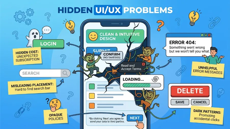
This is the section most design articles skip. Let's talk about what's actually hurting businesses right now.
Problem 1: Inconsistency Across the Product
Inconsistent fonts, buttons that look different on each page, icons that don't match these feel like small things. But they quietly destroy trust.
Users expect consistency. When something looks different, their brain asks: "Is this the same product? Is this safe?"
The fix: build a simple design system. Even a basic one. Define your colors, fonts, button styles, and spacing rules. Then follow them everywhere.
Problem 2: No Emotional Design Strategy
Here's the market gap almost no article addresses: emotional connection in UX.
Most designers focus on usability. Few focus on how the product makes users feel. But emotional attachment is what drives loyalty.
Think about products you love not just use, but love. Duolingo's encouraging streak messages. Spotify's yearly Wrapped feature. Apple's packaging experience.
These aren't accidents. They're intentional emotional design decisions.
You can do this at any scale. A friendly error message instead of "404 Not Found." A celebratory animation when a user completes a task. A personalized dashboard greeting. These small touches create emotional stickiness.
Problem 3: Ignoring Accessibility
This one matters more than ever. The European Accessibility Act came into force in June 2025. And beyond legal requirements, over 1.3 billion people worldwide have some form of disability.
Poor contrast, tiny text, no keyboard navigation these exclude real users who want to use your product.
55% of UX professionals now say accessibility is a top priority. Is it on your list?
Problem 4: Designing for the Business, Not the User
This is the most common and most painful mistake I see.
Stakeholders want features. Product managers want certain flows. Executives want certain things highlighted. So designs get built around internal preferences instead of real user behavior.
43% of organizations lack proper processes to make design decisions based on user feedback. The result? Products that look great internally and frustrate externally.
The fix is user research. Even simple usability testing 5 users, 5 tasks, 1 hour reveals more than months of assumptions.
How Personalization in UX Design Drives Retention Even Higher
This is where design gets exciting for me.
Personalized UX increases user retention by up to 25%, according to a 2024 Forrester study. And by tailoring experiences with AI and behavioral data, companies are seeing customer engagement rise by around 30%.
But here's the nuance most people miss: personalization doesn't mean complexity. It means relevance.
A fitness app that shows your most-used workout category when you open it. An e-commerce site that surfaces items based on what you browsed last week. A dashboard that shows the metric you check most, front and center.
These aren't massive engineering projects. They're thoughtful design decisions based on data you probably already have.
60% of consumers say they become repeat buyers after a personalized experience. If you're not leveraging the data you collect to personalize the UI, you're leaving retention on the table.
ROI Conversation: How to Talk About UX Investment
If you're a business owner or manager trying to justify a UX budget, here's what I'd tell you.
Poor UX costs 10x more to fix later than investing in it upfront. Redesigns are expensive. Lost customers are more expensive. Support tickets caused by UX confusion are expensive.
One stat that cuts through every budget meeting: companies that allocate 10% of their development budget to UX report an 83% increase in conversions.
Design-led companies grow revenue 32% faster and see 56% higher shareholder returns over five years compared to those that don't prioritize design.
This isn't a creative investment. It's a business investment.
Practical Steps You Can Take Right Now
You don't need to rebuild your entire product to improve UI/UX design. Start here:
Week 1: Run a 5-second test on your homepage with real people. Ask what they understand in 5 seconds. Fix what they don't.
Week 2: Check your mobile experience on a real phone. Not an emulator. Time how long pages load. Try completing your most common user flow with one hand.
Week 3: Look at your analytics. Where do users drop off? That's your UX problem list, already prioritized.
Week 4: Talk to 5 users. Not to sell them. To watch them use your product. You'll see things you never would have found in data alone.
Ongoing: Set up tools like Hotjar, Mixpanel, or Microsoft Clarity to watch session recordings. Seeing real user behavior is humbling and transformative.
Design Is the Competitive Advantage You're Not Using
UI/UX design isn’t decoration. It’s not something you “do at the end.” It shapes how users feel about your product and whether they choose to come back.
A 35% improvement in user retention rarely comes from one massive redesign. It comes from consistent, user-centered decisions that reduce friction, build trust, and create emotional connection over time.
The businesses winning in 2026 are treating UX as a core business function, not an afterthought. They understand that great design directly impacts engagement, retention, and revenue.
The latest UI/UX design trends in 2026 are all moving in the same direction: faster experiences, cleaner interfaces, accessibility-first design, personalized interactions, AI-assisted workflows, and emotionally intuitive products that feel effortless to use.
If you’ve been delaying improvements to your product experience, the cost of waiting is real. Users who leave rarely come back. But the users you retain often become loyal advocates who recommend your product to others.
Start small. Start today. Better experiences create better businesses and your users will notice the difference.
Frequently Asked Questions About UI/UX Design
Q: What's the difference between UI and UX design?
UI (User Interface) design refers to the visual elements of a product how it looks. UX (User Experience) design refers to the overall experience of using a product how it feels and flows. Great products need both working together.
Q: How does UI/UX design increase user retention?
Good UI/UX design reduces friction. When users find what they need easily, complete tasks quickly, and enjoy the experience, they come back. Research shows that improving UX to retain just 5% more customers can increase profits by 25-95%.
Q: How much should a business invest in UX design?
Forrester research shows that every $1 invested in UX returns up to $100. Companies allocating 10% of their development budget to UX see an 83% increase in conversions. The investment pays for itself many times over.
Q: How long does it take to see results from UX improvements?
Some changes like fixing mobile responsiveness or improving navigation labels can show results within days in bounce rate and session time data. Broader retention impacts typically become visible over 1-3 months.
Q: Do small businesses need to invest in UI/UX design?
Absolutely. In fact, the competitive advantage is greater for small businesses. Users don't compare your experience only to similar small businesses they compare it to every great digital experience they've ever had. Good UX is how smaller players win against bigger ones.

FAQ
Frequently Asked Questions
We offer end-to-end digital solutions including website design & development, UI/UX design, SEO, custom ERP systems, graphics & brand identity, and digital marketing.
Timelines vary by project scope. A standard website typically takes 3-6 weeks, while complex ERP or web application projects may take 2-5 months.
Yes - we offer ongoing support and maintenance packages for all projects. Our team is available to handle updates, bug fixes, performance monitoring, and feature additions.
Absolutely. Visit our Works section to browse our portfolio of completed projects across various industries and service categories.
Simply reach out via our contact form or call us directly. We will schedule a free consultation to understand your needs and provide a tailored proposal.