
Brand Style Guide Checklist for Startups (Guide 2026)


I've watched too many startups launch with a great idea and a messy brand. One founder shows up in a blue logo. Next week, the deck is green. The website uses a third font nobody remembers picking. It's not a big deal on day one. But by month six, customers can't tell if it's the same company.
That's what a brand style guide fixes. It's not a fancy design document for big corporations only. It's a simple rulebook that keeps your brand looking and sounding like you, everywhere it shows up. Even if you're using automated branding tools to create assets faster, a style guide ensures every logo, color, font, and message stays consistent.
In this guide, I'll walk you through a complete brand style guide checklist for startups. You'll learn exactly what to include, why each piece matters, and how to avoid the mistakes I see founders make again and again. By the end, you'll know what "done" actually looks like for your brand guidelines.
What Is a Brand Style Guide
A brand style guide is a single document that defines how your brand looks, sounds, and behaves. Think of it as your brand's rulebook. It covers your logo, colors, fonts, images, and tone of voice. Anyone on your team, or any outside agency, can open it and know exactly how to represent your brand.
Here's the direct answer, if you're short on time: a brand style guide should include your logo usage rules, color palette, typography, imagery style, brand voice, and core messaging all in one place, easy to find, easy to follow.
Startups skip this step because it feels like a "later" task. But branding for new businesses actually gets harder to fix the longer you wait. Every social post, every pitch deck, every hire without guidelines adds one more inconsistent version of your brand into the world. Fixing that later costs far more time and money than setting it up now.
A good brand identity checklist also protects you as you grow. New hires, freelancers, and partners will represent your brand without you in the room. Your guidelines become the source of truth so nobody has to guess.
It also helps to know the difference between brand identity and brand image. Brand identity is what you control: your logo, colors, fonts, and voice. Brand image is what people actually think of you, shaped by every experience they have with your brand. A style guide can't force people to love you, but it makes sure the identity behind that image is clear, honest, and consistent every time someone meets your brand.
Do You Need to Rebrand, or Just Add Guidelines?
Not every messy brand needs a full rebrand. If your logo and name still feel right, but your visuals are inconsistent, a style guide alone can fix most of the damage. But if your positioning has shifted, or your current look no longer matches who you serve, it may be time to rebrand a business properly, starting from the strategy and rebuilding the visual identity around it. Either way, the checklist below still applies. A rebrand just means you're filling it in from scratch.
Section 1: Logo Usage Guidelines
Your logo is the face of your brand. But a logo file alone isn't enough. You need rules for how it's used. This is where logo and visual identity work together: the logo is the mark, and the rules around it are what keep that mark looking sharp everywhere it appears.
Logo Variations
List every version of your logo: full logo, icon-only mark, horizontal and stacked layouts, and light/dark versions. Startups often only have one file. That breaks the first time someone needs to place your logo on a dark background or a tiny app icon.
Logo Spacing Rules
Set a clear-space rule around your logo. A simple method: use the height of your logo's icon as the minimum space on all sides. This stops people from cramming your logo next to text or other images.
What Not to Do
Show real examples of misuse: don't stretch it, don't recolor it, don't add drop shadows, don't place it on a busy photo. A picture is worth more than a paragraph here. Founders remember "don't do this" faster when they see it.
Quick tip: Export your logo in PNG, SVG, and EPS formats. Save each version with a clear file name, like logo-primary-dark.svg, not logo-final-v2-USE-THIS.png.
Section 2: Brand Color Palette
Color does more work than most founders realize. Color psychology shows that people form an opinion about a brand within seconds, and color is a huge part of that first impression. Blue often reads as trustworthy. Green reads as natural or growth-focused. Bold colors like orange or red can signal energy and confidence.
Your visual identity checklist should define:
- Primary colors: 1 to 2 main brand colors
- Secondary colors: 2 to 4 supporting colors for accents
- Neutral colors: grays, whites, and blacks for backgrounds and text
- Exact codes: HEX, RGB, and CMYK for every single color
Don't just say "our brand blue." Give the exact HEX code, like #1A73E8. Without exact codes, every designer picks a slightly different shade, and your brand color palette slowly drifts apart across your website, app, and print materials.
Section 3: Typography Guidelines
Fonts carry personality just like colors do. A rounded, friendly font feels approachable. A sharp, geometric font feels modern and confident. Your brand fonts should match the personality you want people to feel.
Keep your typography hierarchy simple:
- Heading font: used for titles and big statements
- Body font: used for paragraphs, easy to read at small sizes
- Accent font (optional): used sparingly for quotes or callouts
Most startups only need two fonts. More than that, and your materials start to look cluttered. Also list font weights (bold, regular, light) and minimum sizes for readability, especially on mobile screens.
Section 4: Imagery, Photography, and Iconography Guidelines
This is one part of the branding checklist for startups that gets skipped most often, and it shows. Inconsistent photos and icons make a brand feel unplanned, even if the logo and colors are perfect.
Photography Guidelines
Decide on a consistent style: bright and airy, moody and dark, candid and real, or polished and staged. Note whether you use real people, stock photos, or product shots only.
Illustration Style Guide
If you use illustrations, define the line weight, color palette, and level of detail. Flat, minimal illustrations feel different from hand-drawn, textured ones. Pick one lane and stay in it.
Iconography Guidelines
Set rules for icon style too: outlined or filled, rounded or sharp corners, consistent stroke width. Icons are small, but people notice when they don't match.
Together, these visual branding standards make sure every image on your website, app, and social feed feels like it belongs to the same brand.
Section 5: Brand Voice and Tone of Voice Guide
Visuals get most of the attention, but your words matter just as much. Your brand voice guidelines describe how your brand talks. Is it playful? Formal? Direct? Warm?
A simple way to define this: pick three adjectives that describe your brand's personality. For example: friendly, confident, no-nonsense. Then write a short example of what your brand would say, and what it would not say, in a given situation.
Your tone of voice guide should also flex by channel. Your tone on Twitter/X can be more casual than your tone in an investor email. But your core personality stays the same underneath both.
Section 6: Brand Messaging Framework
This is where mission, values, and positioning live. Your brand messaging framework should be short enough that your whole team can remember it, not a 10-page manifesto nobody reads twice.
Include:
- Mission and vision statement: why you exist, and where you're headed
- Brand values: the 3 to 5 principles that guide decisions
- Brand positioning: who you serve, and why you're different
- Tagline guidelines: how and where your tagline appears (and where it shouldn't)
This section keeps messaging consistency across your website copy, ads, sales calls, and investor decks. When everyone on the team understands the "why" behind the brand, their messaging naturally aligns, even without a script.
Section 7: Brand Asset Management and Governance
A style guide is only useful if people can find it and use it. This is the step most startup branding guides skip, and it's the one that determines whether your guidelines actually get followed.
- Store it centrally: Use Google Drive, Notion, or a shared brand portal. Don't bury it in someone's inbox.
- Keep a live asset library: Store approved logos, templates, and photos in one folder, organized clearly.
- Assign an owner: One person should approve new brand assets and update the guide as the brand evolves.
- Review it yearly: Startups grow fast. Revisit your guidelines every 6 to 12 months to keep them relevant.
Brand consistency isn't a one-time project. It's a habit your whole team builds together.
Brand Identity for SaaS and Tech Startups: What's Different
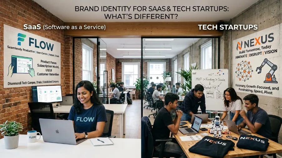
Software companies face a specific challenge. Your brand doesn't just live on a website and business card. It lives inside a product: dashboards, buttons, error messages, onboarding emails, in-app notifications. So brand identity for SaaS and tech startups needs a few extra rules on top of the basics.
- UI color tokens: Your color palette needs to map directly to your product's design system, not just your marketing site. Define primary, success, warning, and error states clearly.
- Component consistency: Buttons, cards, and icons inside your app should follow the same visual rules as your logo and marketing pages.
- Voice inside the product: Error messages and empty states are brand moments too. A witty, human tone here builds more trust than dry system text.
- Dark mode rules: Most SaaS products offer dark mode now. Your guidelines should show how your logo, colors, and icons adapt when the background flips.
This is also where the line between a startup's simple brand guide and a full corporate brand identity system starts to blur. Larger, more established companies often need a full design system, with detailed rules for every UI state, every device, and every team. If you're a startup today, you don't need that level yet. But building your style guide with a bit of structure now makes it much easier to expand into a full corporate brand identity system later, without starting over.
Your Startup Brand Style Guide Checklist
Here's the full brand identity checklist in one place:
- Logo variations, spacing, and misuse examples
- Primary, secondary, and neutral color palette with exact codes
- Heading, body, and accent fonts with hierarchy rules
- Photography, illustration, and icon style guide
- Brand voice and tone of voice guide
- Mission, vision, values, and positioning statement
- Tagline usage rules
- Centralized, accessible brand asset library
- A named owner and a review schedule
If you can check every box above, you have a brand guidelines template strong enough to support your startup as it grows, hires, and expands into new channels.
Common Mistakes: Brand Style Guide Checklist for Startups
I'll be honest, most startups don't fail because they lack creativity. They fail because their brand looks different everywhere it appears. That's exactly why having a brand style guide checklist for startups is so valuable it keeps every touchpoint consistent without adding unnecessary complexity.
A few patterns I see often:
- Too much, too soon: A 40-page guide nobody reads. Keep it short. A one-page quick-start section helps far more than a dense manual.
- No real examples: Rules without visuals are easy to misread. Show right and wrong side by side.
- Guidelines nobody can find: If it takes 10 minutes to locate the logo file, people will just grab whatever version is handy.
- Set once, never updated: Your brand should evolve as you grow. Guidelines need small updates along the way, not a total rebuild every few years.
Avoiding these mistakes is really what separates strong, consistent branding from a brand that quietly falls apart across channels.
The keyword is included once in a way that reads naturally and is suitable for SEO without feeling forced.
Final Thoughts
A brand style guide isn't busywork. It's the difference between a brand people remember and one that fades into the background. Every strong, recognizable company, big or small, has one thing in common: consistency. And consistency starts with a clear, simple set of rules everyone can follow.
You don't need to get this perfect on day one. Start with the checklist above, fill in what you know, and refine it as your startup grows.
If you'd rather skip the guesswork and get a professional brand identity built right the first time, our brand identity service team at CyberCraft Bangladesh can help you build a complete visual and verbal identity: logo, colors, typography, voice, and a style guide you'll actually use. Reach out, and let's build a brand that looks like you, everywhere it shows up.
FAQs About Brand Style Guide Checklist for Startups
What should a brand style guide include?
At minimum, it should include your logo usage rules, color palette with exact codes, typography, imagery and icon style, brand voice, and core messaging like your mission and values. These pieces cover both how your brand looks and how it sounds.
How is a brand style guide different from a logo file?
A logo file is just one asset. A brand style guide is the full rulebook. It tells people how to use that logo, alongside your colors, fonts, images, and voice, so your brand stays consistent everywhere.
Do small startups really need a full brand style guide?
Yes, even a simple one helps. You don't need 40 pages. A clear, one-page summary with your logo, colors, fonts, and a few voice notes is enough to keep your brand looking like one company, not five.
How often should I update my brand guidelines?
Review your guide every 6 to 12 months. Startups change fast. New products, new markets, new team members. Your guidelines should grow with you, not stay frozen from day one.
Can I create a brand style guide without hiring a designer?
You can start one yourself using the checklist in this guide. But for a polished, professional identity that's built to scale, working with a brand identity design team saves time and avoids costly inconsistencies later.

I’m Mitu Das, a JavaScript developer, ERP product architect, and SEO specialist from Bangladesh. I work at CyberCraft Bangladesh, where I help build simple, scalable software, SaaS platforms, and business solutions. My goal is to create technology that helps companies save time, automate daily tasks, and grow faster. I enjoy combining development, product ideas, and SEO strategies to create useful digital solutions for modern businesses.
Writes about